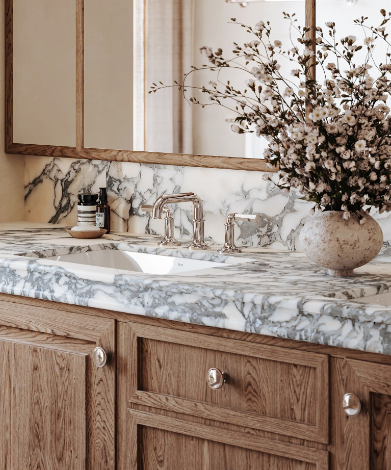
Bathroom
Bathroom


Architecturally inspired color palettes
Architecture styles of the 20th century inspired the new collection of color palettes by Wallpaper* and Victoria + Albert. Editor-in-chief Sarah Douglas looked to the tonal ranges employed by Belgian minimalists, the splashes of primaries in Brazilian modernism and the color-popped chromatics in American postmodernism, adapting and reimagining shade and hue for the contemporary bathroom environment. Your journey into modern ‘bathitecture’ begins here.
Victoria + Albert and Wallpaper*
Color Palettes

Belgian Minimalism
With references to raw and untreated materials, this palette has a minimizing, focusing effect.
Explore

Brazilian Modernism
A thrilling, pioneering movement in contemporary South American architecture and design
Explore

American Postmodernism
A palette that is confident, industrial, dramatic, and fearlessly contrasting
Explore
Explore
Belgian Minimalism

Edge - RAL 260 70 10
With references to raw and untreated materials, this palette has a minimizing, focusing effect.
Color Exploration
Belgian Minimalism

Referencing the Belgian minimalist movement in design and architecture, Douglas' subtle color palette is inspired by the works of architects Glenn Sestig, Vincent Van Duysen and Luc Tuymans. Incorporating cool, calm, soft colors – light blues, linen-like pastels, stone and slate greys – the tonal range of the Victoria + Albert and Wallpaper* Belgian Minimalism palette references raw and untreated materials and has a minimizing, focusing effect. By removing attention from objective form and turning attention to the essence of the surrounding environment, this subtly nuanced palette creates a gentle ambience across a bathroom.
Download Swatch Guide

Explore
Brazilian Modernism

Vetralla – RAL 170 30 20
A thrilling, pioneering movement in contemporary South American architecture and design
Color Exploration
Brazilian Modernism

A thrilling, pioneering movement in contemporary South American architecture and design informs the Brazilian Modernism palette. Referencing the work of mavericks Lina Bo Bardi, Marcio Kogan and Oscar Niemeyer, the Victoria + Albert and Wallpaper* Brazilian Modernism spectrum comprises rich, deep colors – greens, earth tones, glass-brick blues – as well as concrete and translucency. Bo Bardi’s combination of brightness and brutalism was an inspiration for Douglas – particularly the Italy-born innovator’s use of red accents and architectural detail breaking out of large areas of industrial grey concrete that introduces contemporary, graphic playfulness to the smooth rendered mass.
Download Swatch Guide

Explore
American Postmodernism

ios – RAL 095 90 59
A palette that is confident, industrial, dramatic, and fearlessly contrasting
Color Exploration
American Postmodernism

The work of Frank Gehry, Philip Johnson, Michael Graves, and Robert Venturi – the pluralism, irony, paradox and contextualism of American postmodernism – all contribute to a palette that is confident, industrial, dramatic, and fearlessly contrasting. Think monochromatics with pops of color – steel, graphite, grey, black, with soft gold, green glass. Douglas recognized that America’s postmodernist buildings embraced color like no other architectural movement, giving façades variety and personality through the deployment of colored glass, ceramic tiles, or stone – an aesthetic sensibility that can be adapted and applied to the bathroom.
Download Swatch Guide

Select From
Our Finishes
Select From
Our Finishes


Select from Victoria + Albert and Wallpaper’s custom color palettes to personalize the exterior of our freestanding bathtubs and sinks in a rich array of RAL colors, in gloss or matte finishes. Coordinate hues to complement bathroom décor, or let color lead the design principle.
Select from Victoria + Albert and Wallpaper’s custom color palettes to personalize the exterior of our freestanding bathtubs and sinks in a rich array of RAL colors, in gloss or matte finishes. Coordinate hues to complement bathroom décor, or let color lead the design principle.

collaboration quote
“The Emotional Impact Of Color Has a New Relevance. These Palettes Have Been Created to Help Shape Our Mood, Improve Our Wellbeing and Bring Light into Our Day-to-day Lives”
Sarah Douglas – Wallpaper* editor-in-chief
collaboration quote
“The Emotional Impact Of Color Has a New Relevance. These Palettes Have Been Created to Help Shape Our Mood, Improve Our Wellbeing and Bring Light into Our Day-to-day Lives”
Sarah Douglas – Wallpaper* editor-in-chief
Search All
Bathtubs
Search All
Bathtubs
Browse By Category


Browse By Category
Browse By Category
Browse By Category
Find a Showroom